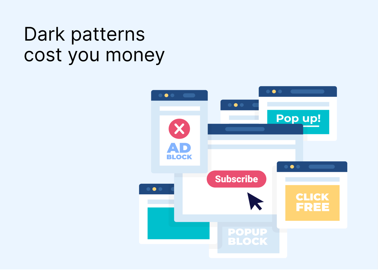
Let’s talk about dark patterns on the internet – shady tricks some online marketers and UX designers use in an attempt to make more sales.
What are dark patterns?
Dark patterns are manipulative design solutions that businesses use on their websites to trick users into doing something they weren’t initially going to do – click on a certain button, spend more time on the website than needed, or make a purchase.
There are different types of dark patterns. Sometimes it takes just one button to turn a design solution into a dark pattern, sometimes there’s much more effort to it. Here are some of the common tricks in UX designю
1. Misleading buttons
Have you ever accidentally agreed to notifications from a website because the Yes button was simply bigger and brighter than the No button? Or almost downloaded an app instead of using the website because you couldn’t find the Continue with mobile web button?
By hiding or misplacing the buttons, websites often trick users into subscribing to their newsletters or notifications, downloading their products, accepting cookies, or opening the ads. This happens because a lot of users are not very attentive when it comes to pop-up banners and ads – and try to close them as fast as possible and click the red button without really reading what it says.
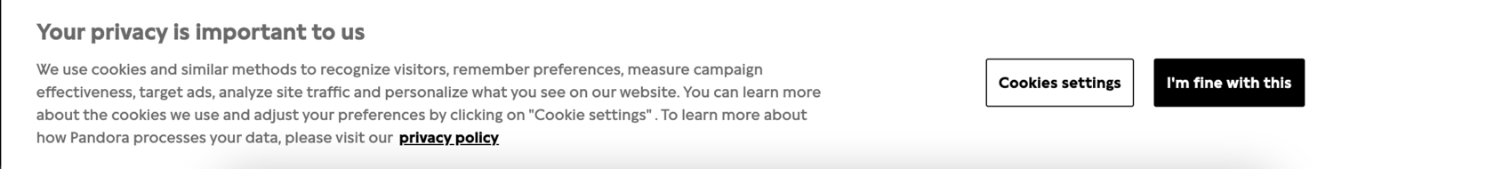
Many people will click on the black button just because it’s darker
Even though this trick might seem innocent, it’s better to avoid using it on your website. A couple of misleading buttons – and you will lose your customers’ trust.
2. Shame-into-Action
Sometimes designers don’t hide buttons but name them in a way to make more attractive for users. You’ve seen the buttons saying “No, I like paying full price” or “I’m boring and I don’t want your newsletter”. That low-key shaming makes some of the users change their minds about what button to press.
The bad thing about this pattern is that websites that use it are trying to attract an audience that’s not really interested in their product. And sneaky tricks like this will only annoy users even more.
3. Intrusive subscription banners
Another poor UX design solution is stuffing your website with pop-up banners on every scroll or just forcing the user to watch your banner for 15-20 minutes without the option to close it. There’s very little chance that users will actually change their minds and click Subscribe instead of Hide just because the banner is too clingy.
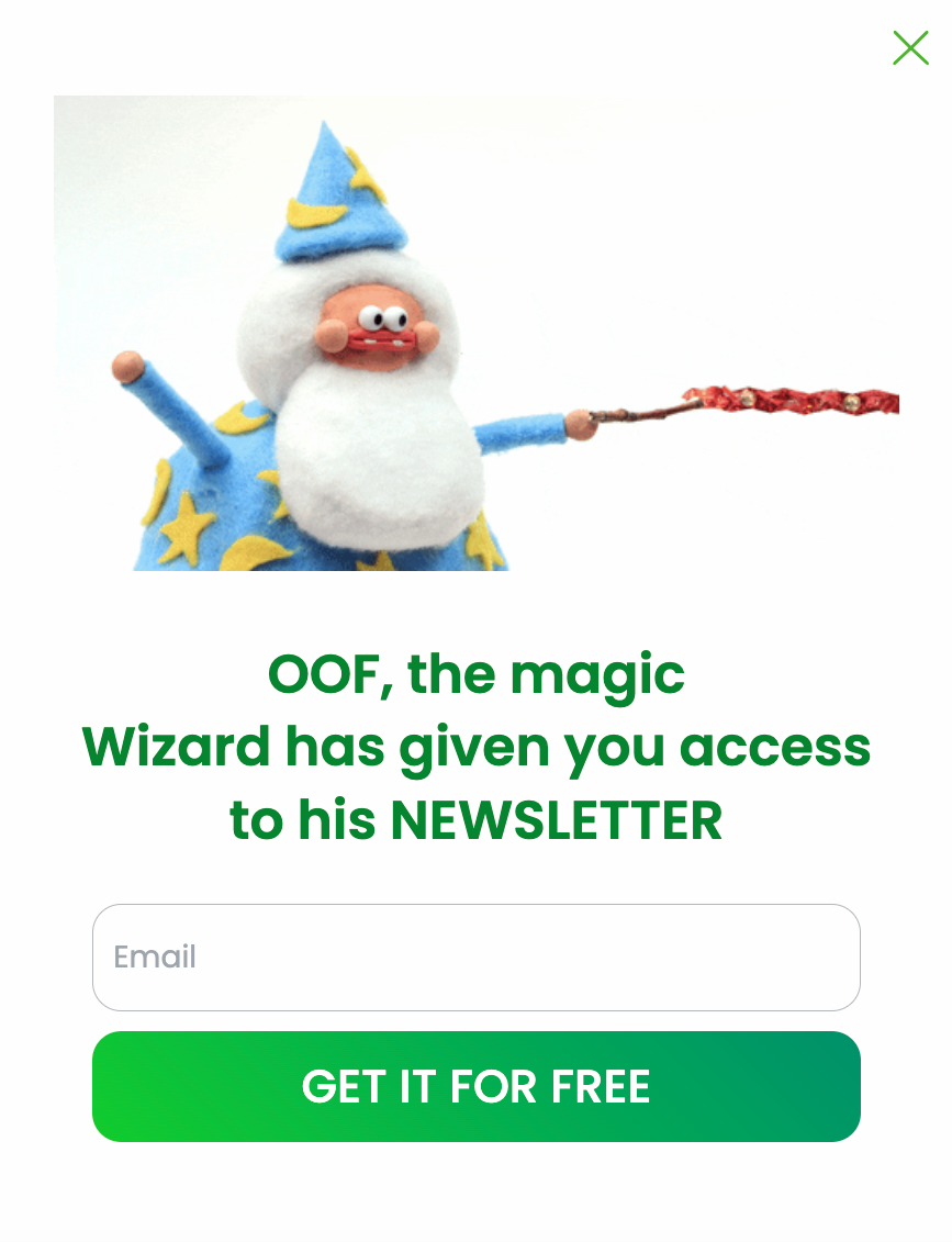
This banner looks cool, but do we really need to see it on every other page we open on the website?
4. Disguised ads
Some marketers think it’s a good idea to make an advertisement look like a piece of useful content so that the customers click on it without realizing that it’s an ad. According to Hubspot, 40% of people who open ads click on them because they find them interesting, and 34% click on ads by mistake. That’s almost the same amount of people!
By avoiding disguised ads you’ll simply make sure that more users will trust your website and will be more likely to visit it again. Plus, fewer people will be annoyed with the product you’re advertising.
5. Forced continuity
There are not many things as off-putting as websites that force you to enter your email address to keep reading or apps that require your bank card information for a couple of days of a trial period. It looks like these apps and websites are hoping that users will forget to cancel the subscription – and it’s an instant turn-off for many people.
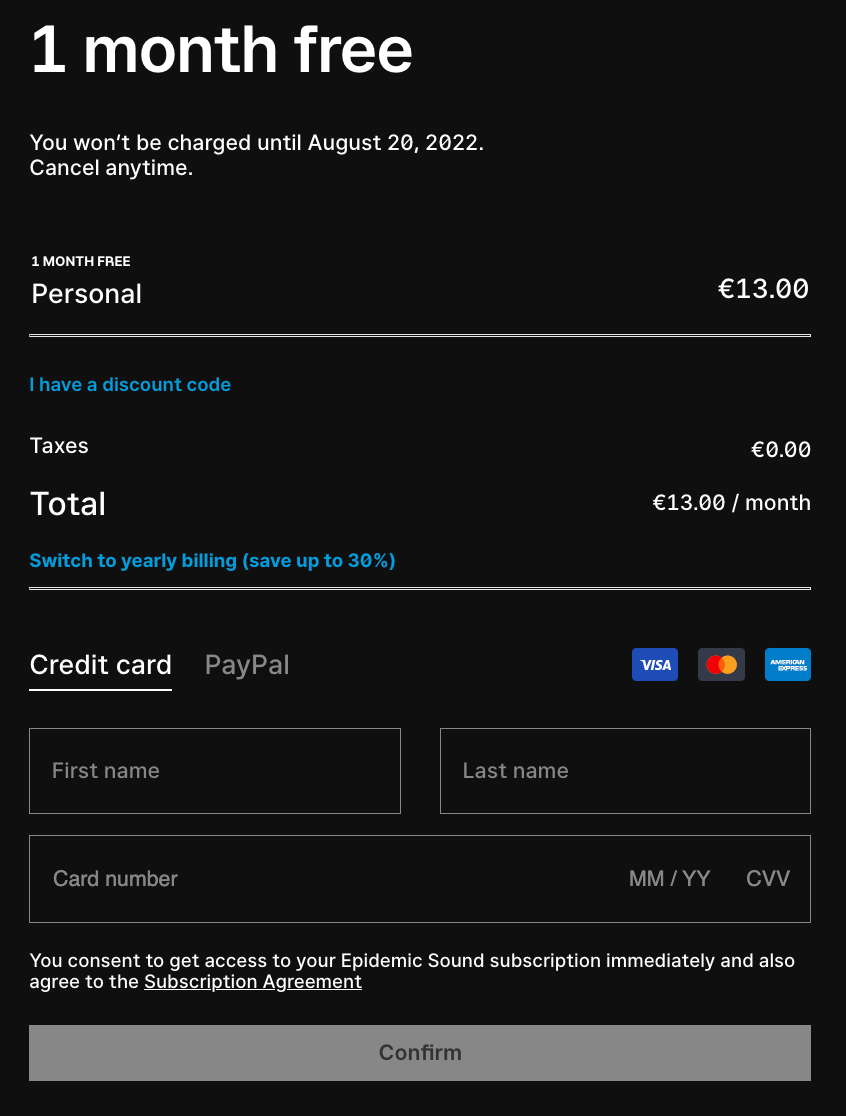
Why would they need credit card info for the trial month? 👀
6. Subscription Games
Sometimes designers and marketers make the cancellation of subscriptions very complex on purpose. The idea behind this is to gain a huge subscriber base by simply not letting users cancel the newsletters. There’s only one problem: there won’t be any conversion if most of the users in the subscriber base are basically hostages of your weekly newsletters.
Unsubscribing from a newsletter or notifications should be as easy as signing to them in the first place. There’s no need to hide the button and turn a simple action into a 10-step process.
7. Hidden costs
Many online stores are guilty of hiding the final price of the order until the very last click in the checkout process. Meanwhile, for most online shoppers added costs are the decisive factor when making an online purchase. 48% of people abandon eCommerce websites during checkout because of the unexpectedly expensive delivery price and taxes. So it’s best to keep the delivery pricing policy and tax information as clear as possible in order to have more users that actually buy your products and not abandon their carts.
The same applies to additional items randomly added to the shopping cart – this often happens when purchasing airplane tickets or software.
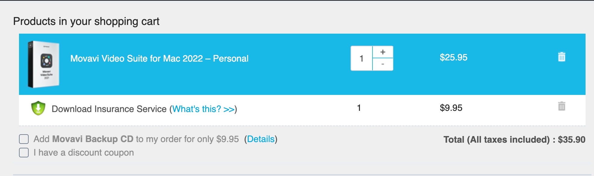
We tried purchasing the software, but somehow there are two items in the shopping cart
8. False availability timers
Another very common trick is triggering a FOMO by adding fake countdowns for a discounted price and Only a few left signs. Although quite popular this trick is not recommended to use. First, it gives off a TV market vibe, second and more importantly, it makes buyers trust you less.

This banner has been there for at least a week
9. Disabled basic browser features
Some websites purposefully disable basic and very useful browser features by breaking the back button, messing with bookmarking, and not allowing to copy and paste. These things might force users into staying on the website longer, but there’s absolutely no technical reason to use them.
Why Should You Avoid Using Dark Patterns?
Why is it best to avoid using such tricks? First and foremost, because of them, you lose your customers’ loyalty and trust. Dark patterns can increase abandonment on your website and affect your brand image. Besides, some of them are even illegal. On top of that, many of these tricks overload your website making it too slow and annoying to users.
According to Google research, most online shoppers expect websites to load within 3 seconds. That will be impossible if a website is packed with pop-ups and advertisement banners.